Logo design


These four logos were created during my internship at a foundation called "RollWithUs." This
foundation assists individuals with disabilities in reintegrating into their communities. The first
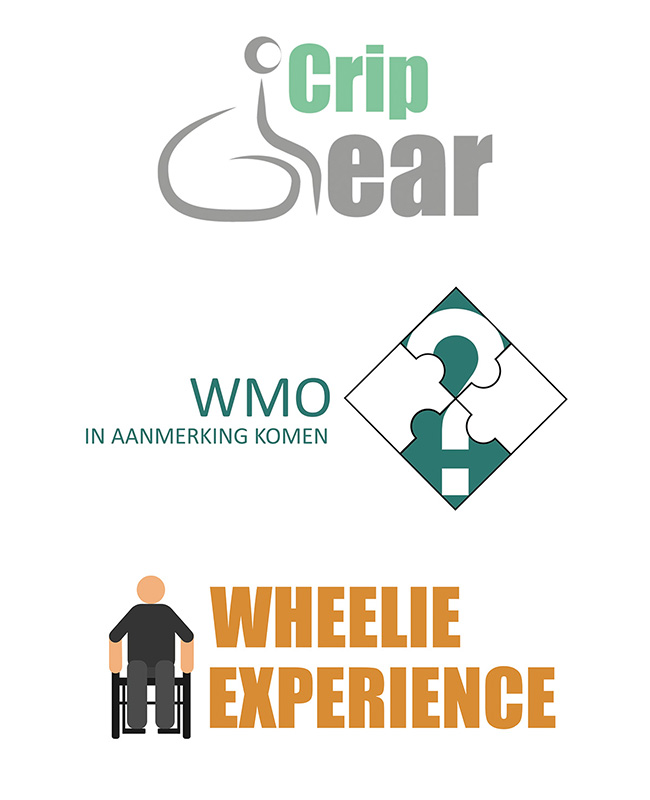
two logos were designed for videos that would be available to the target audience. The first logo
was created for an explanatory video where puzzle pieces would come together, similar to how an
instructional video would provide answers.
The second logo would be for the explanation about
wheelchairs. This aspect can vary depending on the individual, condition, or type of wheelchair.
Therefore, I chose two styles and merged them together. The person in the wheelchair is depicted as
smooth and flowing, also forming the letter "G" for the word "GEAR," while the other letters in the
logo are bold to represent the contrasting nature of different conditions and wheelchairs.
The third logo was created for a demonstration for healthcare students. The students would be
provided with their own wheelchair to gain a real sense and understanding of people in wheelchairs.
It was essential to create a logo that would be clearly visible from a distance. The stick figure
was chosen to represent no specific gender and to be a universally recognized symbol.
The fourth logo was created for an external company that was developing a new website for the
accounting firm C.D.H. The logo would incorporate colors already used on their website. The image in
the logo represents a box, something that the company wanted to incorporate into their logo design.